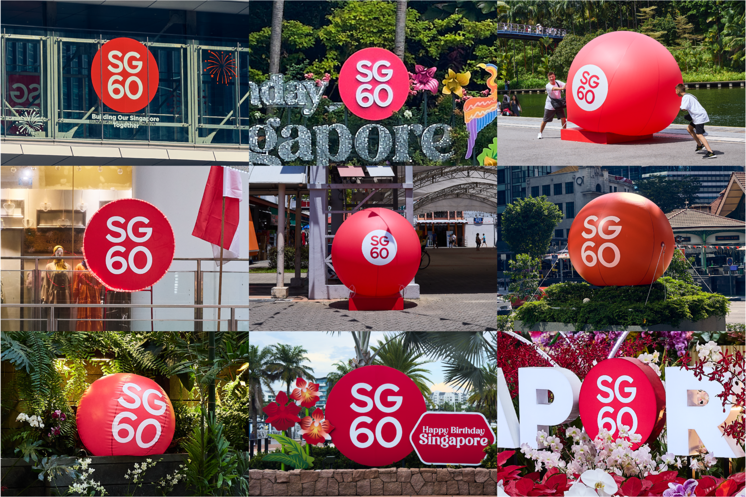
SG60 - Branding & Logo
Creative Direction
Jackson Tan
Designers
Bryan Lim
Samantha Pang
Client
MDDI
2024
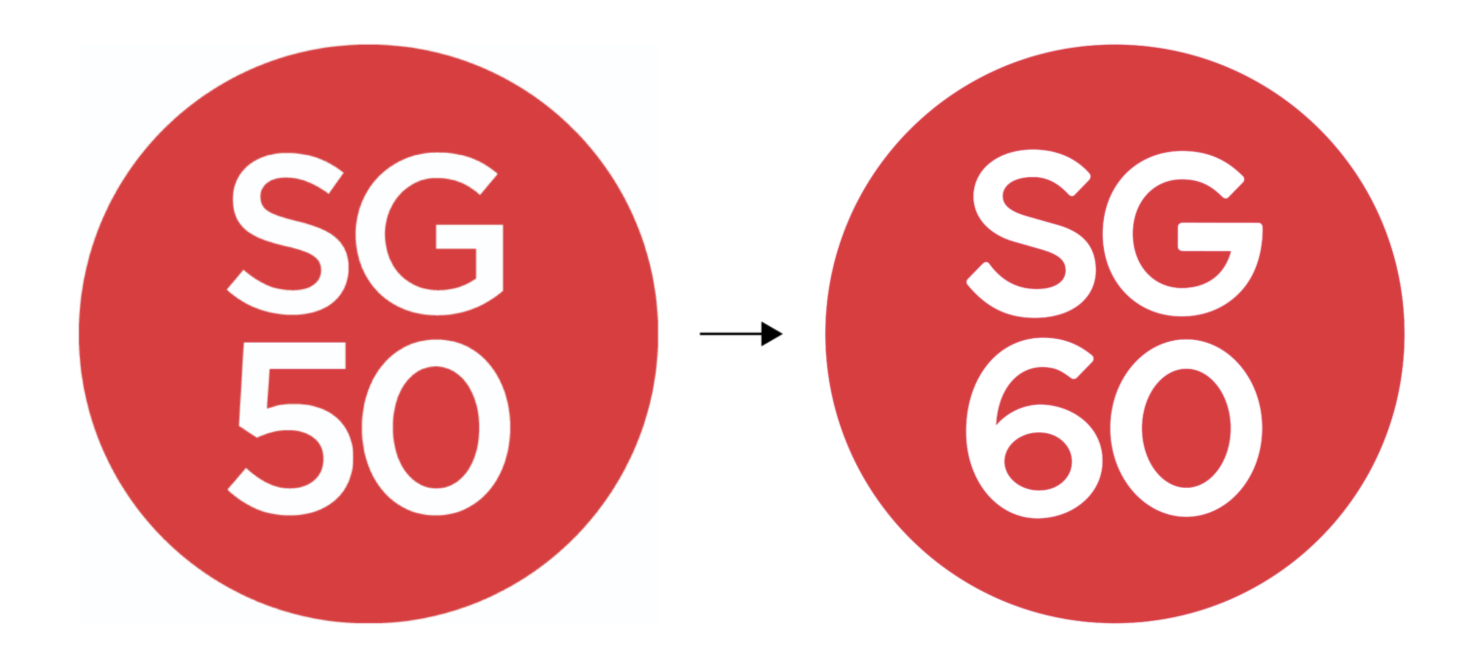
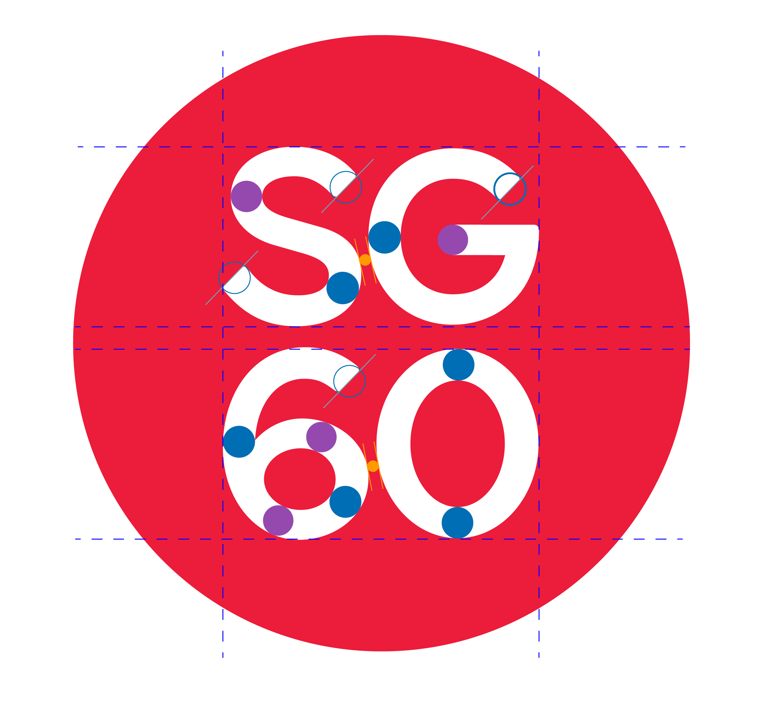
On the cusp of Singapore’s 60th birthday, we looked back on our shared journey as a nation with the aim of capturing the essence of our country, and expressing an identity we could carry into the future. We were inspired by the concept of a little red dot—a moniker that Singapore has come to be known by, and which encapsulates the strength of spirit that belies our island nation’s small size. In developing the SG60 logo, we celebrate our ability to constantly punch above our weight, and the tenacity we display in overcoming our limitations in geography and natural resources. It became a source of national identity and pride, rallying us together and onwards into the years beyond. A custom set of typographic glyphs had to be crafted for the ‘SG60’ that is based off the typeface of the SG Mark while keeping the overall form and balance similar to that of the SG50 logo.